 por
por How I Design Landing Pages That Actually Convert More
In the fast-paced digital landscape, a landing page isn’t just another web page; it’s a critical crossroads where potential customers make a decision. It’s the moment of truth where your marketing efforts either pay off or fall flat. Too often, businesses pour resources into traffic generation only to see their leads vanish into thin air due to an ineffective landing page. This article will peel back the layers of successful landing page design, sharing the proven strategies and meticulous processes I employ to design landing pages that convert at exceptionally high rates, transforming casual visitors into valuable leads and customers.
My Approach to Designing Landing Pages That Actually Convert More
For many, the idea of a «»high-converting landing page»» feels like a mythical beast – elusive and hard to tame. But in my experience, it’s not magic; it’s a methodical process rooted in understanding human psychology, clear communication, and relentless optimization. My approach to landing page design isn’t about flashy graphics or trendy animations; it’s about crafting a focused, persuasive experience that guides a visitor toward a single, desired action. It’s about creating a dedicated page that serves as a direct extension of your marketing message, designed specifically to capture interest and drive conversions.
The cornerstone of my strategy revolves around a deep dive into the user’s journey. Before a single pixel is placed or a word is written, I immerse myself in understanding who the target audience is, what their pain points are, and what motivates them. This foundational knowledge allows me to build a landing page that resonates deeply, addressing their specific needs and offering a compelling solution. Without this empathetic understanding, even the most aesthetically pleasing page will likely struggle to perform, leaving valuable leads on the table. This is where many generic templates fall short; they lack the specific intent and tailored messaging required to genuinely engage a particular segment.
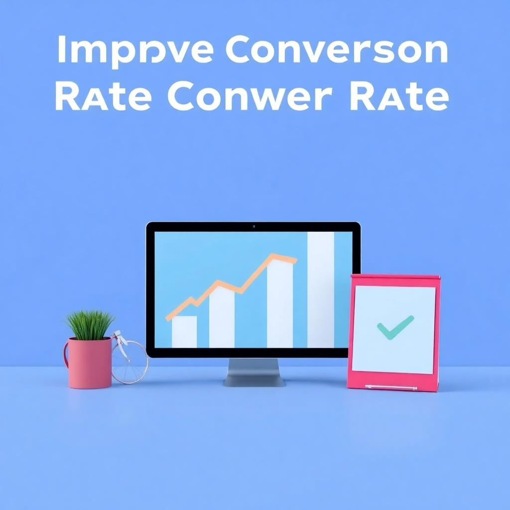
Furthermore, my methodology emphasizes clarity and singularity of purpose above all else. A landing page must have one, and only one, primary goal. Every element on the page – from the headline to the call-to-action (CTA) button – must contribute to achieving that goal, eliminating any potential distractions. This focus is paramount for increasing landing page conversion rate. We’re not building a website to explore; we’re building a dedicated conversion machine. This disciplined approach ensures that visitors are not overwhelmed with choices or information, but rather are gently yet firmly guided towards the desired next step. It’s about making the path to conversion as smooth and frictionless as possible, which directly contributes to effective landing page design tips that truly move the needle.
Ultimately, my secret isn’t a secret at all: it’s a commitment to a user-centric, goal-oriented, and data-driven process. It’s about moving beyond assumptions and relying on insights to build a page that speaks directly to the visitor’s needs and makes the conversion process irresistible. This article will break down each critical component of this strategy, offering actionable advice and practical examples to help you design landing pages that convert with greater efficiency and impact.
Why Most Landing Pages Fail
It’s a common scenario: a business launches a marketing campaign, drives traffic to a shiny new landing page, and then watches in dismay as the conversion rates barely budge. Why do so many landing pages, despite often looking professional, utterly fail to perform their primary function? The answer typically lies in a series of fundamental missteps that undermine the page’s persuasive power and clarity. Understanding these common pitfalls is the first step toward building high converting landing pages.
One of the most pervasive reasons for failure is a lack of clear purpose. Many landing pages try to do too much. They might present multiple offers, link to various sections of the main website, or contain too much information that isn’t directly relevant to the core offer. This creates decision paralysis for the visitor. When confronted with too many choices or distractions, the easiest choice is often to simply leave. A successful landing page must have one clear action it wants the visitor to take, and every element on the page should funnel them towards that action. Without this singular focus, the page becomes a confusing brochure rather than a targeted conversion tool.
Another significant issue is a disconnect between the ad or link that brought the visitor to the page and the page content itself. Imagine clicking an ad for «»50% off premium CRM software»» only to land on a page that talks generally about business solutions and requires you to dig for the specific offer. This immediate mismatch creates distrust and frustration. Visitors arrive with certain expectations, and if those expectations aren’t met instantly, they bounce. This principle, known as «»message match,»» is crucial for optimizing landing pages for conversions. Your headline, imagery, and initial copy must immediately confirm that the visitor is in the right place and that the promise made in the ad is being fulfilled.
Finally, many landing pages fail due to poor design execution, not necessarily aesthetically, but functionally. This includes everything from slow loading times, which can drastically increase bounce rates, to confusing layouts, unreadable fonts, or a non-responsive design that looks terrible on mobile devices. Beyond the technical, there’s often a failure in persuasive design: weak or unclear calls-to-action (CTAs), a lack of social proof, or copy that focuses on features rather than benefits. These seemingly small details cumulatively erode trust and make it difficult for visitors to understand the value proposition or what they’re supposed to do next. Addressing these issues is fundamental to how to improve landing page conversion and move from underperforming pages to assets that genuinely drive results.
My Secret Conversion Strategy
My «»secret»» conversion strategy isn’t really a secret in the clandestine sense, but rather a disciplined, holistic framework that consistently yields superior results. It’s a structured approach to landing page strategy that moves beyond superficial aesthetics and delves deep into the psychology of persuasion and the mechanics of user experience. This methodology is built on the premise that a landing page is not just a digital billboard, but a carefully engineered sales funnel designed to guide a specific audience towards a specific outcome.
The core of my strategy is encapsulated in a five-pillar framework: Audience-First, Singular Focus, Persuasive Copy, Intentional Visuals, and Relentless Testing. Each pillar is interdependent, and neglecting one can undermine the effectiveness of the others. This integrated approach ensures that every component of the landing page works in harmony to achieve the highest possible conversion rate. It’s about building a robust foundation that can withstand the scrutiny of potential customers and effectively communicate value. This framework is what allows me to consistently design landing pages that convert above industry averages.
Firstly, everything begins and ends with the Audience-First principle. Before a single line of code is written or a graphic designed, I invest significant time in understanding the target audience intimately. This involves creating detailed buyer personas, mapping their journey, identifying their pain points, desires, and objections. This deep empathy informs every subsequent decision, ensuring the page speaks directly to their needs and motivations. Without this crucial step, you’re essentially shouting into the void, hoping something sticks. This foundational understanding is key to what makes a landing page convert.
Secondly, I enforce a Singular Focus. Every landing page must have one, and only one, primary goal. Whether it’s to generate a lead, make a sale, or download a resource, this goal dictates every element on the page. Distractions are ruthlessly eliminated. Navigation menus, outbound links, and extraneous information are stripped away to create a laser-focused path to conversion. This clarity is paramount for effective landing page design tips and directly contributes to a frictionless user experience.
Thirdly, Persuasive Copy is not an afterthought; it’s the engine of conversion. I focus on benefit-driven headlines, clear value propositions, and compelling calls-to-action that address the visitor’s pain points and clearly articulate the solution. This is where the audience research truly pays off, allowing the copy to resonate deeply. Fourth, Intentional Visuals are used to support the message, not overshadow it. Images, videos, and layout are chosen to enhance understanding, build trust, and guide the eye, never to distract. Finally, Relentless Testing closes the loop. Through A/B testing and analytics, I continuously optimize the page, making data-driven decisions to incrementally increase landing page conversion rate. This iterative process ensures that the page is always evolving towards peak performance, embodying the principles of conversion rate optimization (CRO).
First, Know Your Real Audience
The most profound secret to designing high converting landing pages isn’t a design trick or a clever piece of code; it’s a deep, almost intimate understanding of the people you’re trying to reach. Before you even think about layouts, colors, or copy, you must first know your real audience. This foundational step is often overlooked or rushed, yet it is the single most critical factor that dictates the success or failure of any landing page strategy. Without this insight, you’re essentially designing in the dark, hoping to stumble upon something that resonates.
Understanding your audience goes far beyond basic demographics. It requires delving into their psychographics – their motivations, fears, aspirations, and the specific problems they are trying to solve. What keeps them up at night? What are their daily challenges? What kind of language do they use to describe their needs? What objections might they have to your offer? Creating detailed buyer personas is an invaluable exercise here. These aren’t just fictional characters; they are archetypes built from data, interviews, and market research that represent your ideal customer segments. Each persona should have a name, a background, goals, pain points, and even preferred communication channels.
For example, if you’re selling a project management software, your audience might include a «»Busy Startup Founder»» who values speed and integration, a «»Corporate Team Lead»» who needs robust reporting and security, and a «»Freelancer»» looking for simplicity and affordability. Each of these personas will have different pain points and respond to different messaging and features. A single, generic landing page will likely fail to capture the attention of all three. Instead, understanding these distinct needs allows you to tailor your landing page’s headline, subheadings, benefit statements, and even the visual elements to speak directly to one specific persona, making the offer feel incredibly relevant and personal. This targeted approach is key to how to design landing pages that convert.
By understanding your audience’s context, you can also anticipate their objections and address them proactively on the page. If your audience is typically price-sensitive, you might include clear pricing tiers or a strong value proposition that justifies the cost. If trust is an issue, prominent social proof and testimonials become essential. Knowing who you’re talking to allows you to craft a message that feels like a direct conversation, not a generic sales pitch. This deep empathetic connection is the bedrock upon which all effective landing page design tips are built, ensuring that your page resonates on a truly personal level and dramatically increases your chances to increase landing page conversion rate.
Design for One Clear Action
Once you deeply understand your audience, the next critical step in designing high converting landing pages is to enforce a singular, unwavering focus: design for one clear action. This principle is often violated, leading to cluttered, confusing pages that leave visitors unsure of what to do next. A landing page is not a buffet of options; it’s a guided path towards a specific goal. Every element on the page must serve this one purpose, eliminating any potential distractions or alternative routes.
Imagine a visitor arriving on your landing page. They’ve clicked an ad or a link because they were interested in a specific offer. Your job is to make it incredibly easy for them to take the next logical step related to that offer. This means stripping away anything that doesn’t directly contribute to that single conversion goal. This includes removing global navigation menus, footer links, social media icons (unless sharing is the primary goal), and any other links that might take the visitor away from your page. The goal is to create a «»conversion tunnel»» where the only way out is to convert or to leave the page entirely. This focused environment is fundamental to optimize landing page for conversions.
The «»one clear action»» should be immediately obvious upon landing. It should be articulated through a prominent, benefit-driven Call-to-Action (CTA). This CTA isn’t just a button; it’s the culmination of your entire page’s persuasive effort. It needs to stand out visually, use action-oriented language, and clearly state what the user will get by clicking it. Instead of a generic «»Submit,»» opt for «»Get Your Free Ebook Now»» or «»Start My 14-Day Free Trial.»» The clarity of the CTA, paired with its visual prominence, significantly influences how to improve landing page conversion.
Consider this example: If your goal is to capture email leads for a free webinar, every piece of content – the headline, the description of the webinar, the speaker’s credentials, the testimonials – should funnel the visitor towards filling out the registration form. There shouldn’t be links to your blog, your company history, or other product pages. The page should answer the question: «»Why should I sign up for this webinar?»» and then provide a clear, easy way to do so. This hyper-focused approach minimizes cognitive load and decision fatigue, making it far more likely that visitors will take the desired action. By ruthlessly adhering to the principle of «»one clear action,»» you transform your landing page design from a general information hub into a powerful, efficient conversion machine.
Words That Sell (Copywriting)
In the realm of high converting landing pages, visuals might capture attention, but it’s the words that close the deal. Effective copywriting is the engine that drives persuasion, articulating your value proposition, addressing pain points, and guiding the visitor towards conversion. This isn’t just about stringing sentences together; it’s about strategically crafting every word to resonate with your audience and compel them to take your desired action. This is where the insights from «»knowing your audience»» truly come to life, transforming raw data into compelling narratives that directly influence how to design landing pages that convert.
The headline is arguably the most critical piece of copy on your entire landing page. It’s the first thing visitors see, and it determines whether they’ll stay or leave. A powerful headline should be clear, concise, and immediately communicate a key benefit or solution that aligns with the ad they clicked. It should create curiosity or directly address a pain point. For instance, instead of «»Our New Product,»» try «»End Your Marketing Overwhelm: Get More Leads in Half the Time.»» The headline must also achieve strong message match with your ad copy to reassure visitors they’re in the right place.
Beyond the headline, the body copy must quickly articulate your unique selling proposition (USP) and focus relentlessly on benefits, not just features. Features describe what your product or service is (e.g., «»10GB cloud storage»»), while benefits explain what it does for the customer (e.g., «»Never worry about losing your files again, with ample space for all your projects»»). People buy solutions to their problems, not just tools. Use bullet points to break down complex information and highlight key benefits in an easily digestible format. Employ language that mirrors your audience’s own vocabulary and tone, fostering a sense of familiarity and trust. This empathetic mirroring is a key component of effective landing page design tips.
Crucially, words that sell also build trust and overcome objections. Incorporate social proof elements like testimonials, customer logos, case study snippets, or trust badges (e.g., «»SSL Secured,»» «»Money-Back Guarantee»»). These elements provide external validation and reduce perceived risk. Your Call-to-Action (CTA) copy also needs careful consideration. It should be action-oriented, specific, and clearly state the value the user will receive. «»Download Your Free Guide»» is far more compelling than «»Click Here.»» By focusing on powerful, benefit-driven, and trustworthy copy, you transform your landing page into a persuasive sales tool, significantly boosting your ability to increase landing page conversion rate.
Visuals That Don’t Distract
While compelling copy lays the foundation for persuasion, visuals that don’t distract are essential for guiding the eye, building trust, and enhancing the overall user experience on high converting landing pages. The role of imagery, video, and overall layout on a landing page is not merely aesthetic; it’s functional. Every visual element should serve to clarify the message, reinforce the value proposition, and gently direct the visitor towards the desired action, without creating cognitive overload or diverting attention.
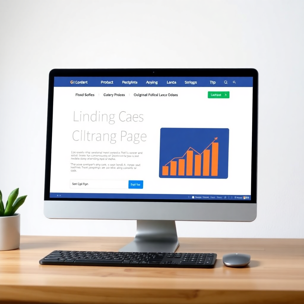
The primary goal of visuals is to support and enhance the copy, not to compete with it. High-quality, relevant images or videos can quickly convey complex ideas, demonstrate product benefits, or evoke emotions that resonate with your audience. For instance, if you’re selling a productivity tool, a screenshot showing the clean interface in action or a short video demonstrating a key feature can be far more effective than a lengthy text description. If your product solves a problem, an image depicting the «»before»» and «»after»» scenario can be incredibly powerful. However, stock photos that feel generic or irrelevant can actually detract from your message, eroding trust and making your offer seem less authentic. Authenticity in visuals is a critical aspect of landing page design.
Layout and whitespace are often overlooked but incredibly powerful visual tools. A clean, uncluttered layout with ample whitespace helps guide the visitor’s eye through the page in a logical flow, from the headline to the subheadings, benefit points, and ultimately to the Call-to-Action. Cluttered pages, conversely, overwhelm visitors and make it difficult for them to discern the most important information, leading to higher bounce rates. Visual hierarchy, achieved through strategic use of font sizes, bolding, and color contrasts, ensures that the most important elements (like your headline and CTA) stand out prominently. This deliberate use of space and emphasis is a core principle of effective landing page design tips.
Furthermore, consistent branding through colors, fonts, and imagery reinforces your company’s identity and builds recognition. The visual style of your landing page should align with your overall brand guidelines and the ad that led the user there, reinforcing message match and professional credibility. Critically, all visuals must be optimized for fast loading times and responsiveness across all devices. A beautiful image is useless if it takes too long to load or appears broken on a mobile screen. By carefully selecting and optimizing visuals that don’t distract, you create an engaging and intuitive experience that supports your persuasive copy and significantly contributes to how to improve landing page conversion.
Testing for Real Results
Designing a landing page based on best practices and informed by audience research is an excellent start, but the journey to high converting landing pages doesn’t end there. In fact, it’s just beginning. The final, and arguably most crucial, step in my conversion strategy is testing for real results. Assumptions, no matter how well-informed, are still assumptions until proven by data. Continuous testing and optimization, a core tenet of Conversion Rate Optimization (CRO), are what transform a good landing page into an truly exceptional one, consistently driving higher conversion rates.
The most common and effective testing method is A/B testing (or split testing). This involves creating two versions of your landing page (A and B), where only one element is changed between them (e.g., a different headline, CTA button color, image, or even a single word in the copy). You then split your traffic evenly between these two versions and track which one performs better in terms of conversion rate. This scientific approach allows you to isolate the impact of specific changes and make data-driven decisions about what resonates most with your audience. For instance, testing two different headlines could reveal that focusing on «»Save Time»» converts better than «»Increase Efficiency,»» providing invaluable insight into your audience’s primary motivation. This iterative process is essential for optimize landing page for conversions.
Beyond A/B testing, other tools provide deeper insights into user behavior. Heatmaps and click maps show you where visitors are looking, clicking, and scrolling on your page, revealing areas of interest or confusion. Session recordings allow you to watch anonymized recordings of actual user sessions, giving you a firsthand look at how people interact with your page – where they hesitate, where they get stuck, or where they simply abandon the process. These qualitative insights often uncover issues that quantitative data alone might miss, such as a confusing form field or a misaligned image that draws attention away from the CTA. Understanding these nuances is key to what makes a landing page convert.
The key to successful testing is to approach it systematically. Don’t just make random changes; form hypotheses based on your audience research and observed data. For example, «»I hypothesize that changing the CTA button from ‘Learn More’ to ‘Get My Free Quote’ will increase conversions by 10% because my audience is ready for a direct offer.»» Test one element at a time to clearly understand its impact, and run tests long enough to gather statistically significant data. This continuous cycle of hypothesize, test, analyze, and implement is what refines your landing page design over time, ensuring that every tweak and adjustment is backed by evidence. By embracing testing for real results, you move beyond guesswork and build a robust system for achieving and maintaining a consistently high increase landing page conversion rate.
In the dynamic world of digital marketing, a landing page is far more than just a place to land; it’s a strategically crafted sales tool, a gateway to lead generation, and a direct reflection of your understanding of your audience. The journey to design landing pages that convert isn’t about chasing fleeting trends or relying on generic templates. It’s about a methodical, empathetic, and data-driven process that begins with a deep understanding of your audience and culminates in relentless optimization.
We’ve explored how common pitfalls like lack of focus and message mismatch sabotage conversion efforts, and then laid out a proven framework: Audience-First, Singular Focus, Persuasive Copy, Intentional Visuals, and Relentless Testing. By truly knowing your audience, you can craft messages that resonate. By focusing on one clear action, you eliminate distractions. By employing words that sell, you articulate value and build trust. By using visuals that don’t distract, you guide the eye and reinforce your message. And finally, by embracing testing for real results, you continuously refine your page to achieve peak performance.
Implementing these strategies will transform your approach to landing page design, moving you from hoping for conversions to actively engineering them. Remember, every visitor represents an opportunity. By investing in effective landing page design tips and committing to conversion rate optimization (CRO), you’re not just building web pages; you’re building bridges between your offer and your audience’s needs, leading to more leads, more sales, and ultimately, greater business success. Start applying these principles today, and watch your landing page conversion rate increase dramatically.